Express Carryout - Restaurant Ecommerce
UX research & strategy
Case Study
Express carryout for a pizza restaurant's mobile experience.
Project Overview
Challenge
For this 3 week sprint, my team was asked to provide a digital express carryout experience for a well known pizza chain's mobile application. Our challenge was to provide a carry-out experience that allowed users to “Skip the Line” once they physically arrived in the store; this needed to fit within the constraints of the existing mobile ordering experience, while also distinguishing itself as a new feature AND aiding users in the external experience of physically picking up their order in store. In essence - our experience in the digital product needed to do a good enough job anticipating the physical experience that users would be having in store as they attempted to “skip the line”. Our main goal - increase user engagement by providing a way for users to avoid waiting in lines when they pick up orders in restaurant locations.
Analysis
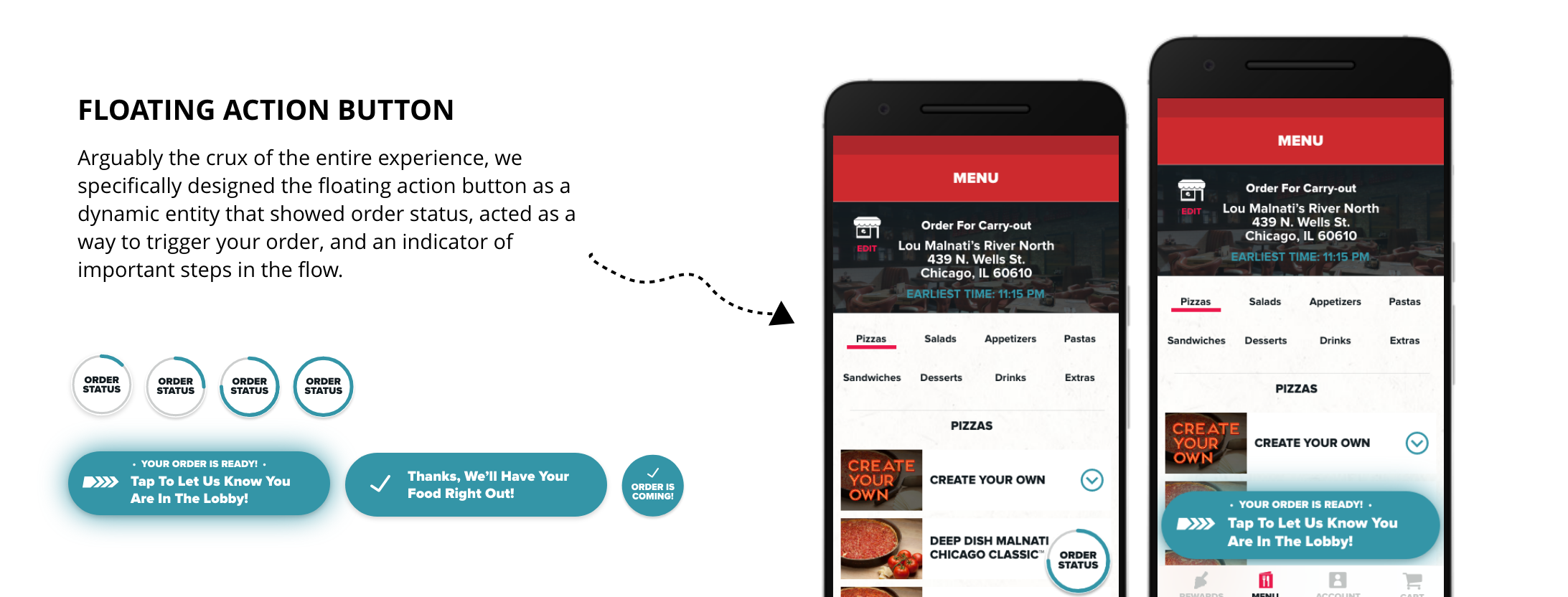
After a week of research defining the similar product experiences and noting our tech constraints, we defined the crux of our experience in several key elements, the most important of which being a single, dymanic button - this "button" or FAB (floating action button) was a dynamic UI element that would alert the users to the various states of the order in progress and assist with pickpup. While it is a tiny UI element, it certainly carried the weigh of the our experience. On-top of optimizing the pizza pick-up process for existing users, we also took the time to consider the various users and how we could leverage this "fast pass experience" as an acquistion incentive for non-account users - we hypothesized that if we could leverage the "skip the line" ability at the appropriate moment in a user's journey, we may be able to successfully aquire them as account holder.
Conclusion
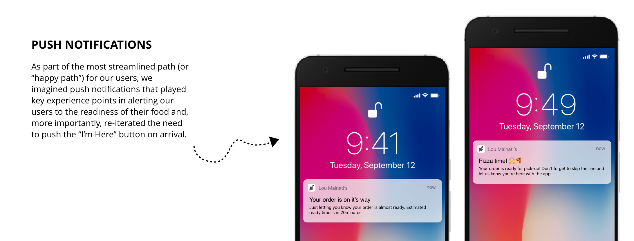
The end result for our efforts were happy clients and an outfacing experience that guided users through a digital journey into a physical one - our experience is currently in development and released July 2020. Coupled with push notifications, our dynamic floating action button, and an experience icon that acted as an important indicator for the experience, we successfully delivered a streamlined ordering experience that we are excited to monitor and continue to optimize our experience through A/B testing and analytic tracking.
Here's our full process...
Initial Research
Understanding the Product
In previous work with this client, my team had already established an experience pattern that allowed users to quickly track their delivery or carry-out order (when it was ready for pick-up, that is); the pattern is simply that once an order is placed, a small Floating Action Button ( a "FAB") will sit in the lower right corner of the screen and change states to indicate order status. Knowing that this was a pattern that we already established, we went into “express carry-out designs” with this in our back pockets.
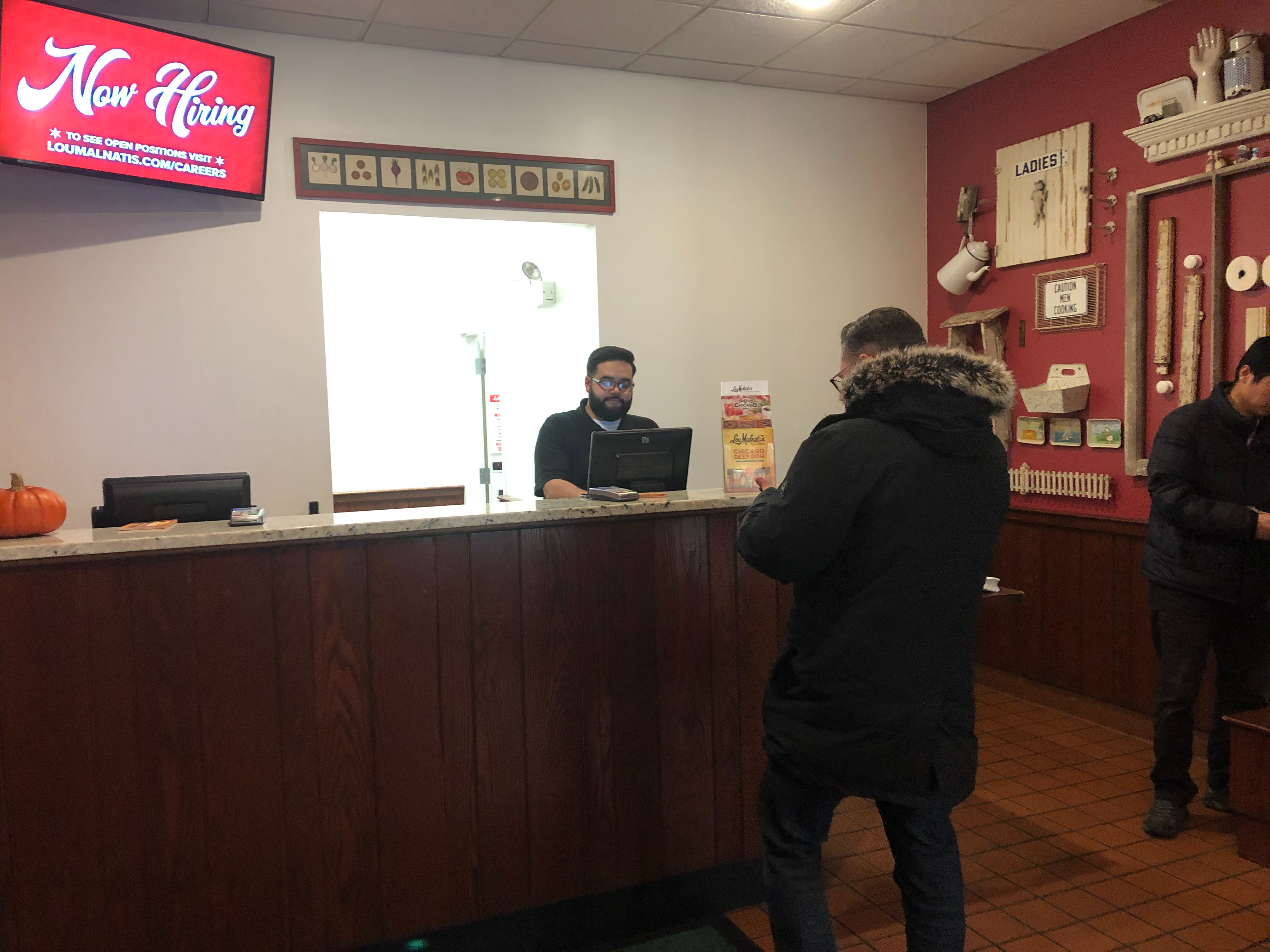
The team's trip to a store location to observe the physcial environment and habits of customers arriving for pick-up.
Understanding the Market
Knowing that our designs would have to guide users through a digital and in-store experience, we started by evaluating what other products and product experiences already existed on the market. Since the rise of “express pick-up” options for consumers, we started our design sprint by evaluating current market products, and more importantly, what typical “express carryout” in-store experiences were. We learned that:
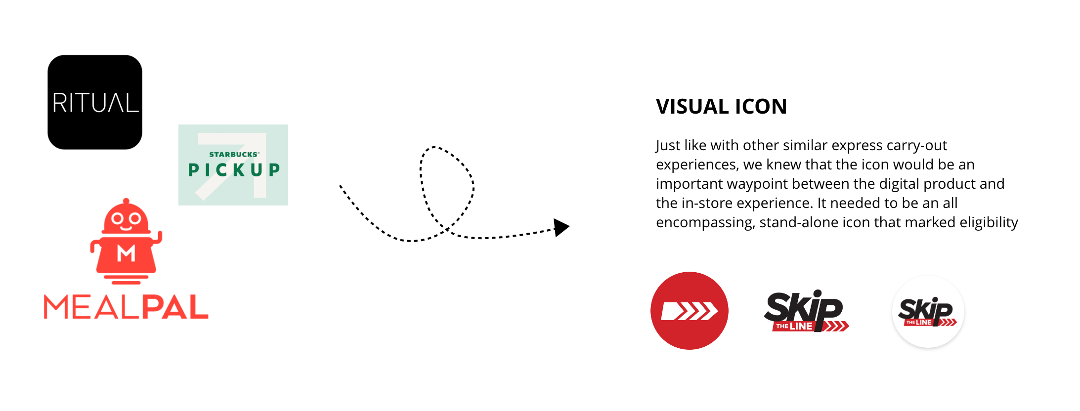
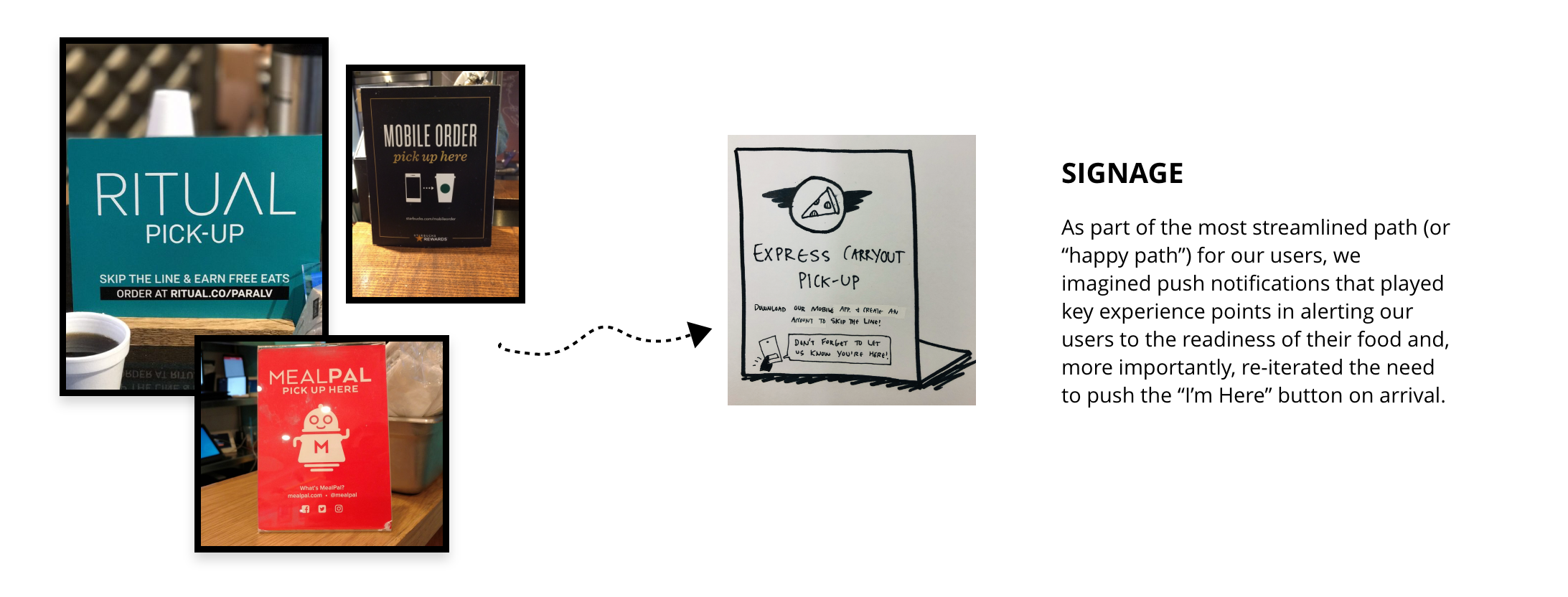
1.Signage is Important
Most experiences have a simple icon or logo that acts as a way point or serpa between the digital experience and the in-person one. Users know to look for this icon once they arrive in store.
2. Pick-up = scan or show
That is, most experiences only require that you physically tap a call-to-action once when you hit purchase. Otherwise, when you arrive at the store, you simply need to show an employee your receipt or scan a tag.
Constraints and Compromises
After evaluating the marketspace, we were able to compare current digital and experience trends to what we knew our product’s constraints would be. We did have several initial constraints for the initial designs were that due to the demands of the Point of Sale system and the way that the restaurant kitchen ran its operations. Namely, at the necessity of the POS, customers would need to physically tap a button that indicated they were at the restaurant and ready for their food. This experience is different from a typical “express carryout” experience, and thus we needed to be mindful to alert users that this was a necessary step in the digital process.

Narrowing In
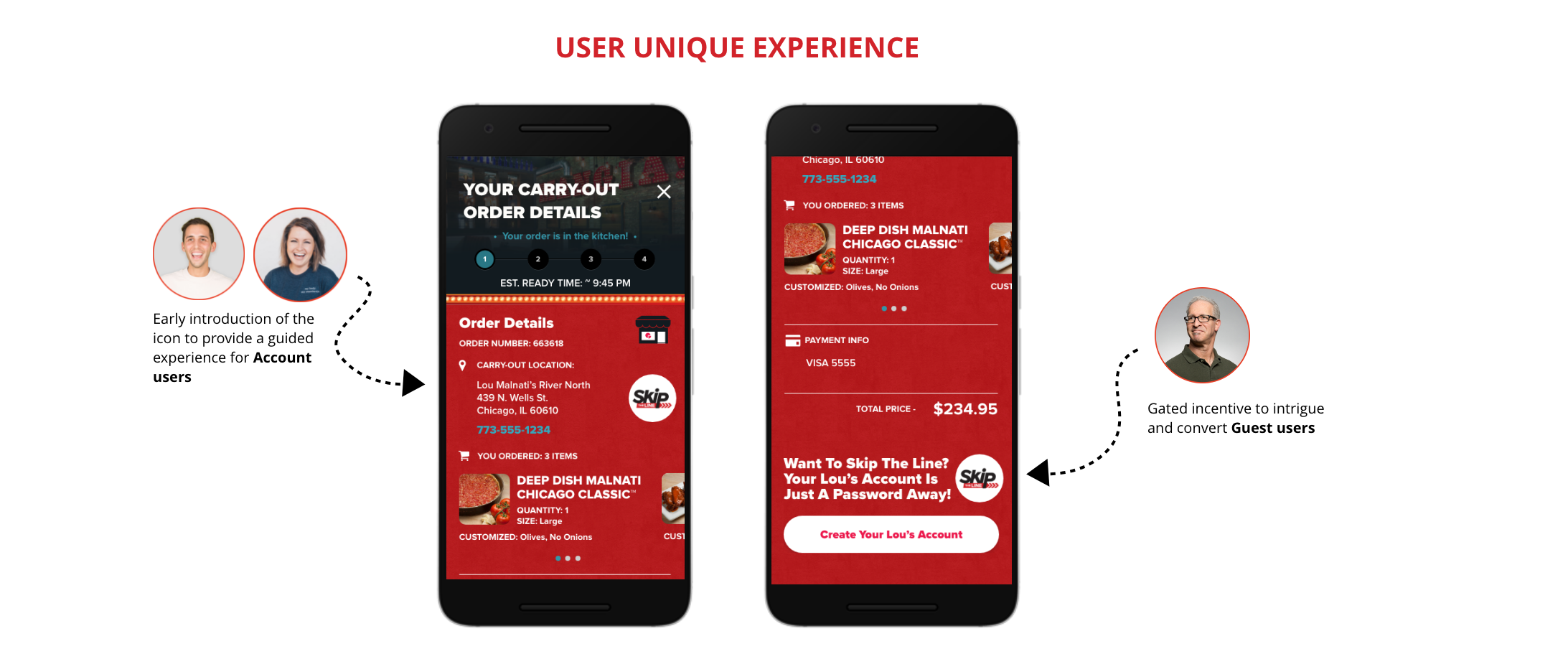
After conducting our in-store and competitive research, we set about doing some user task mapping to get a better, holistic understanding of what our user would need to successfully place and pick-up an order. We had already established three personas based on their user state (account holder, first time account holder, and guest user).
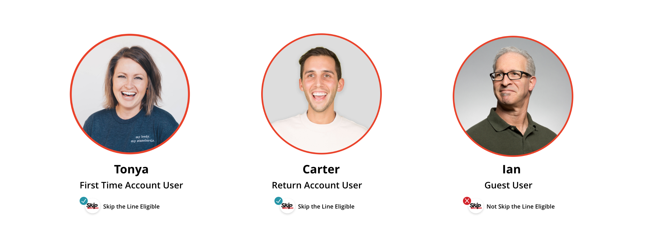
In terms of what personas meant for this feature design, the only necessary call-out is that guest users were not eligible for “skip the line” capabilities; this was a strategic decision on our end, as we hypothesized that holding this perk as an account benefit might prompt guest users to convert to account. We strategically designed messaging to both elevate the “skip the line” offering and easily sign-up for an account for this user type.
For users that were eligible for “skip the line” services, the “Express Carry-out journey” looked something like this:
Design Principles
After We set up some simple design principles for this experience to make sure that we were successfully capturing the user needs.
- Transparency - we wanted to aid users in knowing exactly at what point in their food ordering experience, with the digital product being a necessary facilitator for an in-store pick-up.
- Minimalism - while we knew we needed to assist users in navigating the digital to in-person store experience, we wanted to make sure that we were utilizing elements that didn't provide too much visual weight or comand too much attention in the experience.
- Balance - considering the established UI, we wanted to push the experience to best serve user needs and introduce a new feature, but fit holistically within the existing design experience.
Key Experience Elements
Our last step before starting to design screens was to use our journey map that noted user touch-points to high-light key experience elementsthat would be major waypoints for our users during this experience. They included:
Ideation, Ideation, Ideation
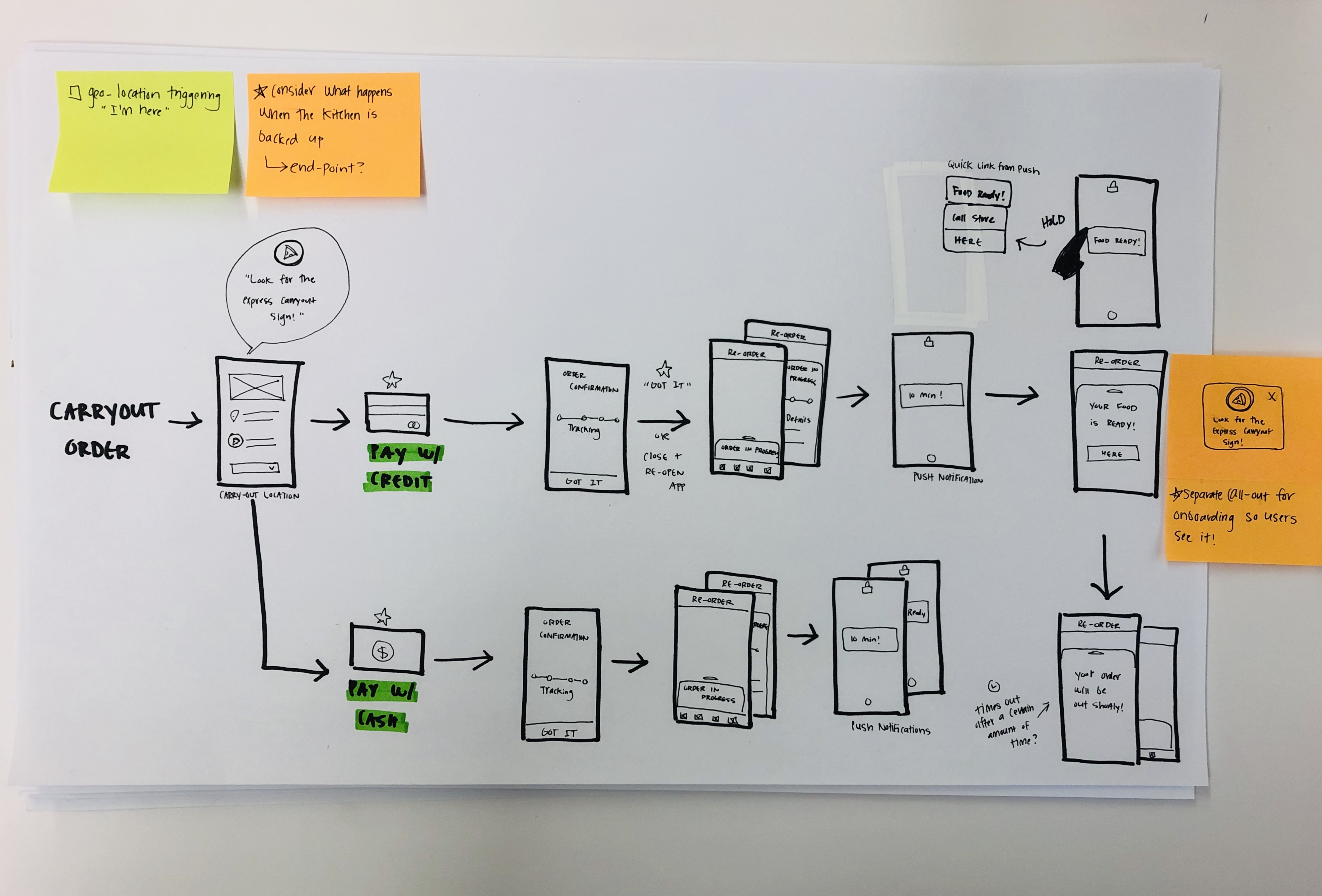
After completing our market research, defining our constraints, establishing our personas, and mapping journies, we next moved into sketching! While we did not have alot of screens to account for with our designs, we were able to iterate quickly to get our initial thoughts out before moving to digital.
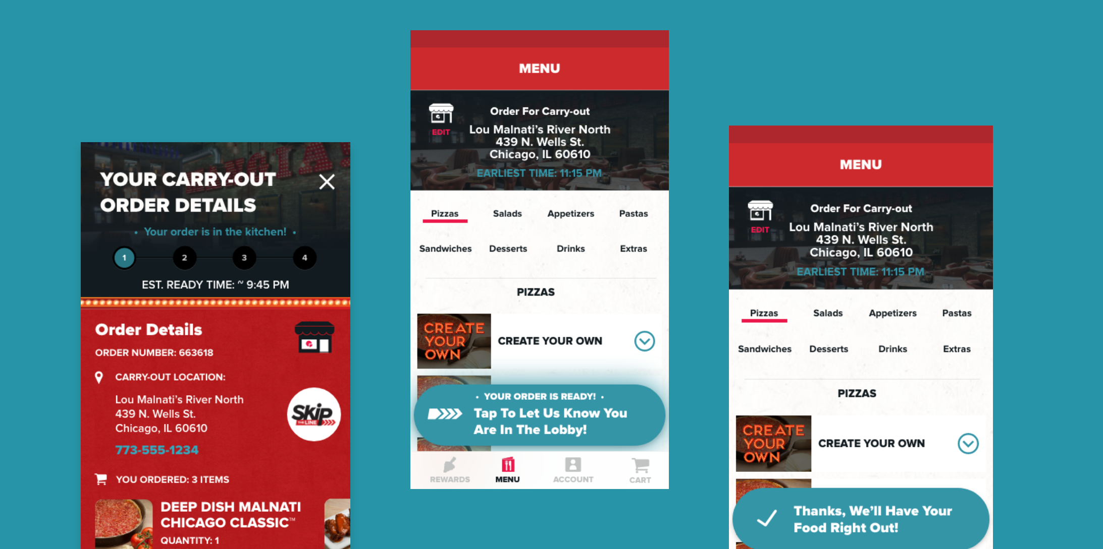
Floating Action Button
Since we already had an established design framework, we only explored two options for the "order in progress" indication. The first option utilized our existing timeline of order status (as shown on our order detail card) while the second design leveraged the much smaller, and compact button.
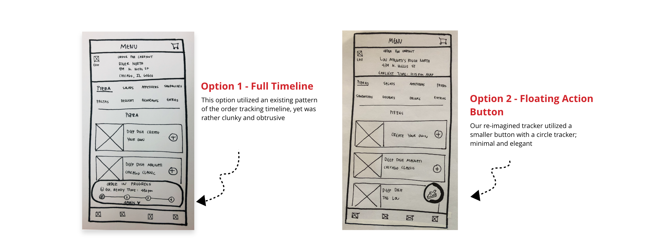
Ultimately we went with the smaller FAB for obvious reasons, the most important of which being that it's un-intrusive nature made it easier for it to appear as a wholistic element accross the interface.
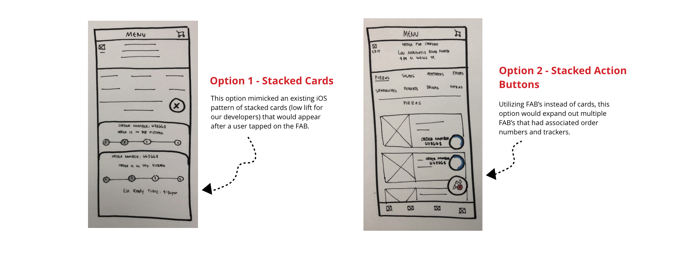
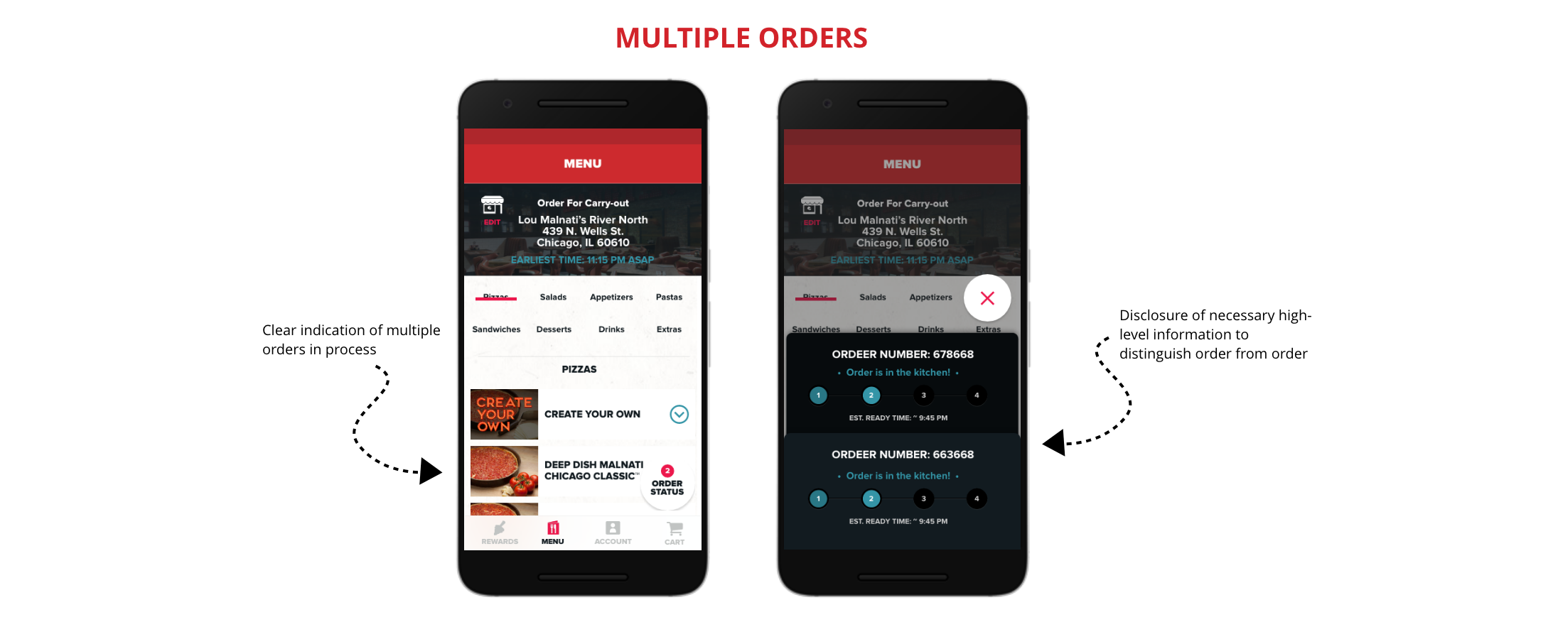
Multiple Orders in Progress
A more interesting design problem for us to solve was the issue of multiple orders in progress at a single time. This essentially meant that we needed to find a way to support multiple Floating Action Buttons that simultaneously triggered their associated order detail cards. Here's what we came up with:
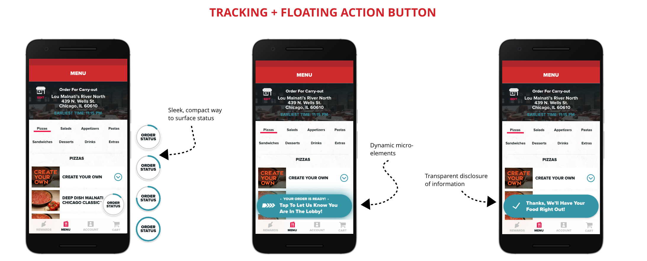
Final Designs
After a few days of iterations, we arrived at our final designs. Keeping in line with our design principle, namely balancing existing UI for a coherent experience, our final designs supported the existing UI while folding in our important Floating Action button and it's various dynamic states in a seamless way. That is, our goal was to support the users in thier new experience without creating elements that drastically confused or jarred them.
Conclusion
Reiterating sentiments already shared, the end result for our efforts was a outfacing experience that guided users through a digital journey into a physical one. Coupled with push notifications, our dynamic floating action button, and an experience icon that acted as an important indicator for the experience, we successfully delivered on what we set out to do. Ultimately this design experience was interesting mostly for the way that it supported a digital to physical experience for users. Our digital tool literally needed to act as a digital compass, with the experience within it weighing heavily on more than just the presentation of the UI.