Connected Health
UX research, strategy, & design
Case Study
Empowering people to take control of their heart health
Project Overview
Blood pressure is a growing epidemic in the US - 1 in 3 American adults have high blood pressue. Seemingly this shouldn't be the case, as there are a mutlitude of platforms and data to provides us with information to potentially act upon. But, all too often this information is not clearly understood. People struggle to interpret what the numbers mean and how they impact their lives. This is a poor environment for managing our most important asset — our heart health. For this two week design sprint, my team of four designers was tasked with the task of conducting research and creating intital design concepts for a mobile application that would pair with a wearable blood monitoring watch. Our human centered design approach lead us to intially wonder what information people needed to manage their blood pressure.
Our Analysis
Putting the human back into health data requires a human-centered design process. My team began by understanding the trends in blood pressure and well-being.Our hypothesis was that people needed different information to act on improving their health. We spoke to health care providers, caretakers, and individuals to learn how people think about and manage their health. We wanted to know how we could empower individuals to be aware of their bodies and take control. According to the American Heart Association, African Americans and Hispanics are at the highest risk. Many Millennials are also at risk in spite of their relative youth. These statistics have done little to change behavior. The increased usage of health devices and activity monitoring has also done little tochange the trends.
We found that the most necessary user wants when it comes to blood pressure were:
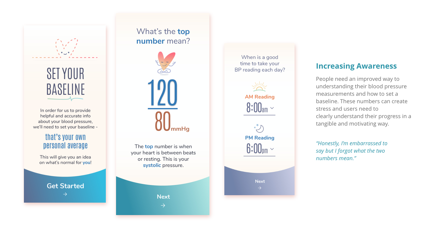
1. Awareness - People need an improved way to understanding their blood pressure measurements and how to set a baseline. These numbers can create stress and users need to clearly understand their progress in a tangible and motivating way.
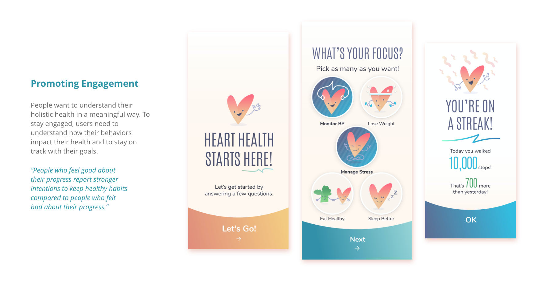
2. Engagement - People want to understand their holistic health in a meaningful way. To stay engaged, users need to understand how their behaviors impact their health and to stay on track with their goals.
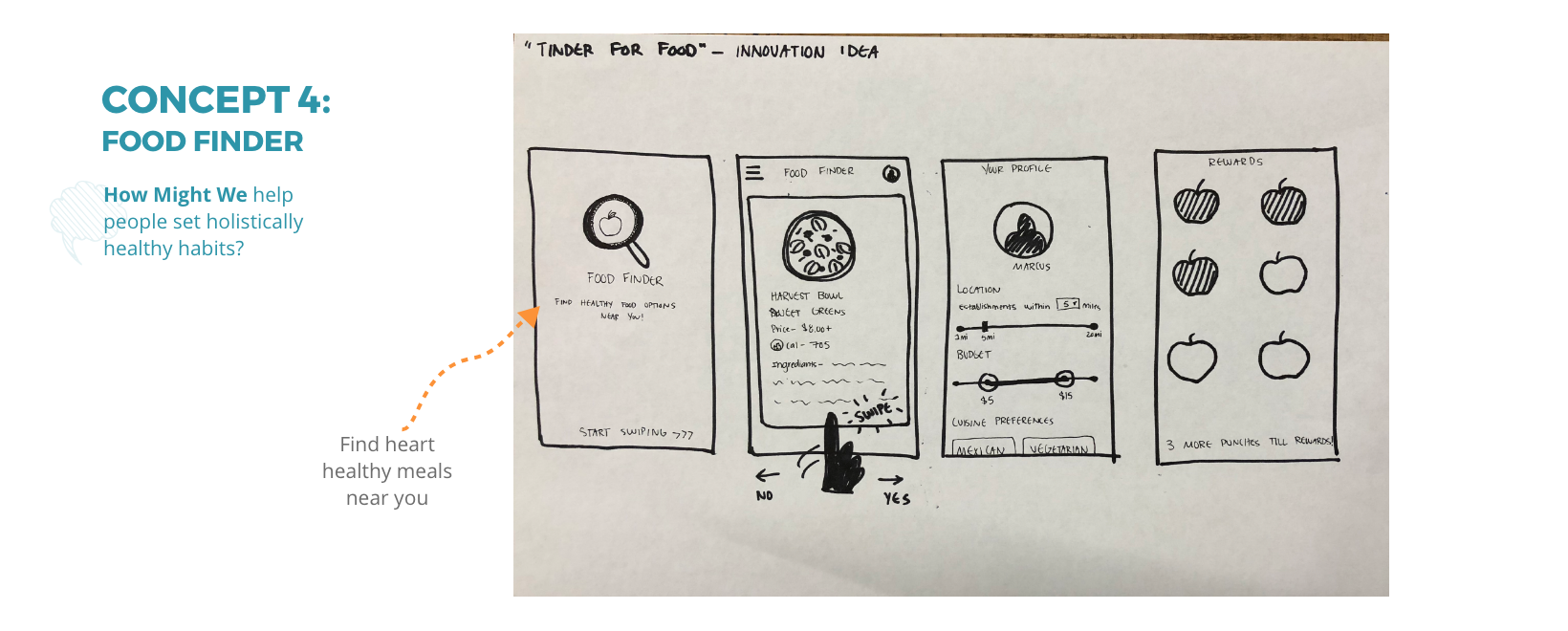
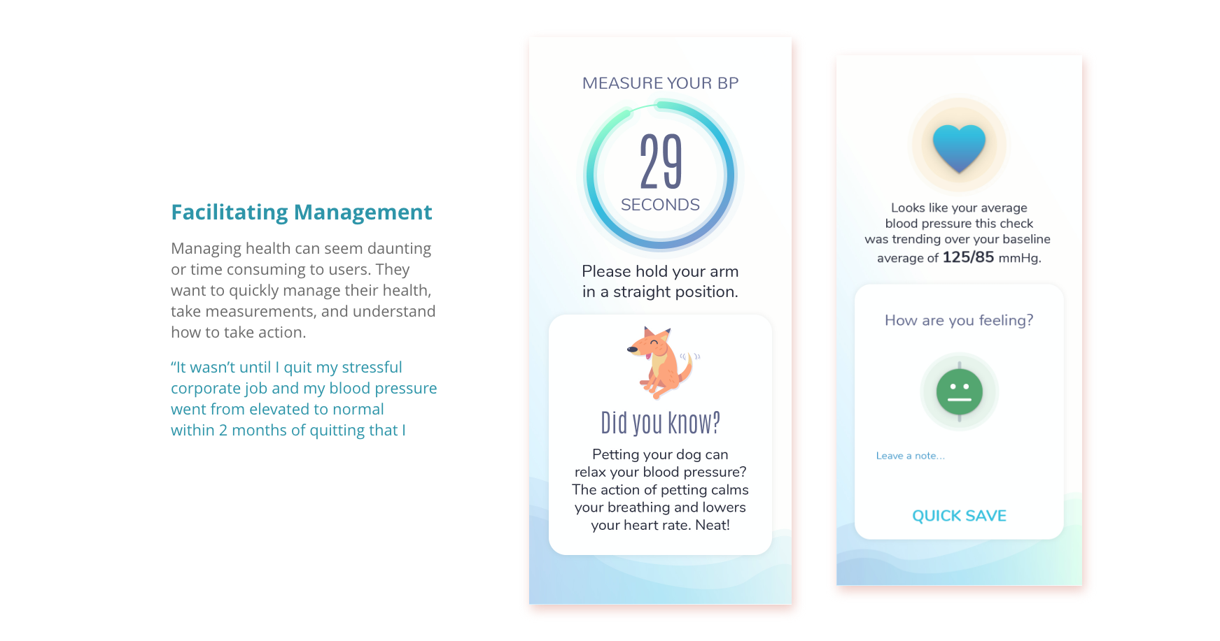
3. Management - Managing health can seem daunting or time consuming to users. They want to quickly manage their health, take measurements, and understand how to take action.
The Conclusion
Our final solution was a series of concepts that focused on awareness, engagment, and management. We found that our users did not understand how different habits affected their blood pressure, and more importantly, heart basics. Our final designs hoped to provide a friendly, engaging experience that encouraged people to be informed, learn, and take control of their health.
Here's our full process...
Initial Research
Understanding the Trends
The Vokal team began by understanding the trends in blood pressure and well-being. We wanted to know the trends and understand the problem, so we did research. According to the American Heart Association, African Americans and Hispanics are at the highest risk. Many Millennials are also at risk in spite of their relative youth. These statistics have done little to changebehavior. The increased usage of health devices and activity monitoring has also done little to change the trends.
We learned:
- Hypertension is increasing - “More than 100 million Americans have high blood pressure”
- Personal health technology is increasing - Smartwatch penetration is 13%. It is 34% amongst those with incomes less than $45,000
- Measurement fluctuates - Updated blood pressure guidelines from the AHA result in more Americans being diagnosed with high blood pressure
- Hypertension in the young - Stroke rates among Millennials have increased and 18% of young adults have high blood pressure.
We also looked at existing products that were doing similar things in the marketplace (fitness trackers, other blood pressure devices. We found that while multiple options for blood testing existed, such as physical at-home tests or arm cuffs, little to none of them provided any product offerings greater than just the act of testing blood pressure.

Narrowing In
User Research
With a growing suspicion that users needed more than just the physical blood pressure reading, our next step was interviewing real humans to understand the what they needed from a blood pressure experience. We interviewed five total inviduals - a mix of healthcare professionals and inviduals with high blood pressure. At the end of our research, we were left with some good insights as to the experiences that individuals with high blood pressure.
Our hypothesis was that people needed different information to act on improving their health.
Through speaking with our users, we learned that users need guidance and education throughout their health experience; it’s more than just providing users the numbers. We also learned:
1. High BP is asymptomatic - there are no direct symptoms that may necessarily cause a patient to seek medical attention specifically for blood pressure; it can go unseen and untreated.
2. BP numbers need to be packaged into holistic monitoring - it’s not necessarily the daily BP readings that are important; daily monitoring is useful to get people to engage or correlate contributing lifestyle factors to higher/lower BP.
3. BP is an extra dimension to fitness and health - the best preventative measures are lifestyle factors such as regular fitness and healthy eating.
4. Lifestyle changes are the biggest contributing factor to BP and hypertension - the same lifestyle changes that are used to prevent BP are the same ones used to treat it
Utlimately there seemed to be a very simple changes an individual could make to support better heart health, yet a gap of knowledge telling them how to do so. We wondered - how do we make health information human-centric? The various devices in the market made the data itself easily accessible to people, providing information to potentially act upon. But, all too often the information itself was not being clearly understood.
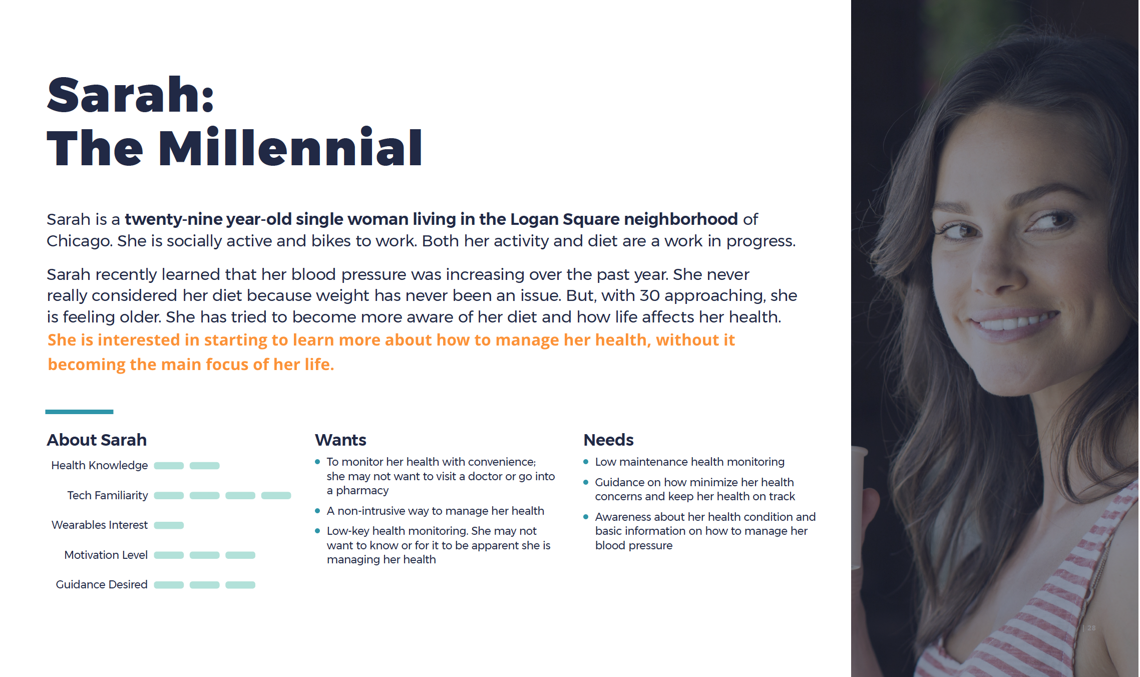
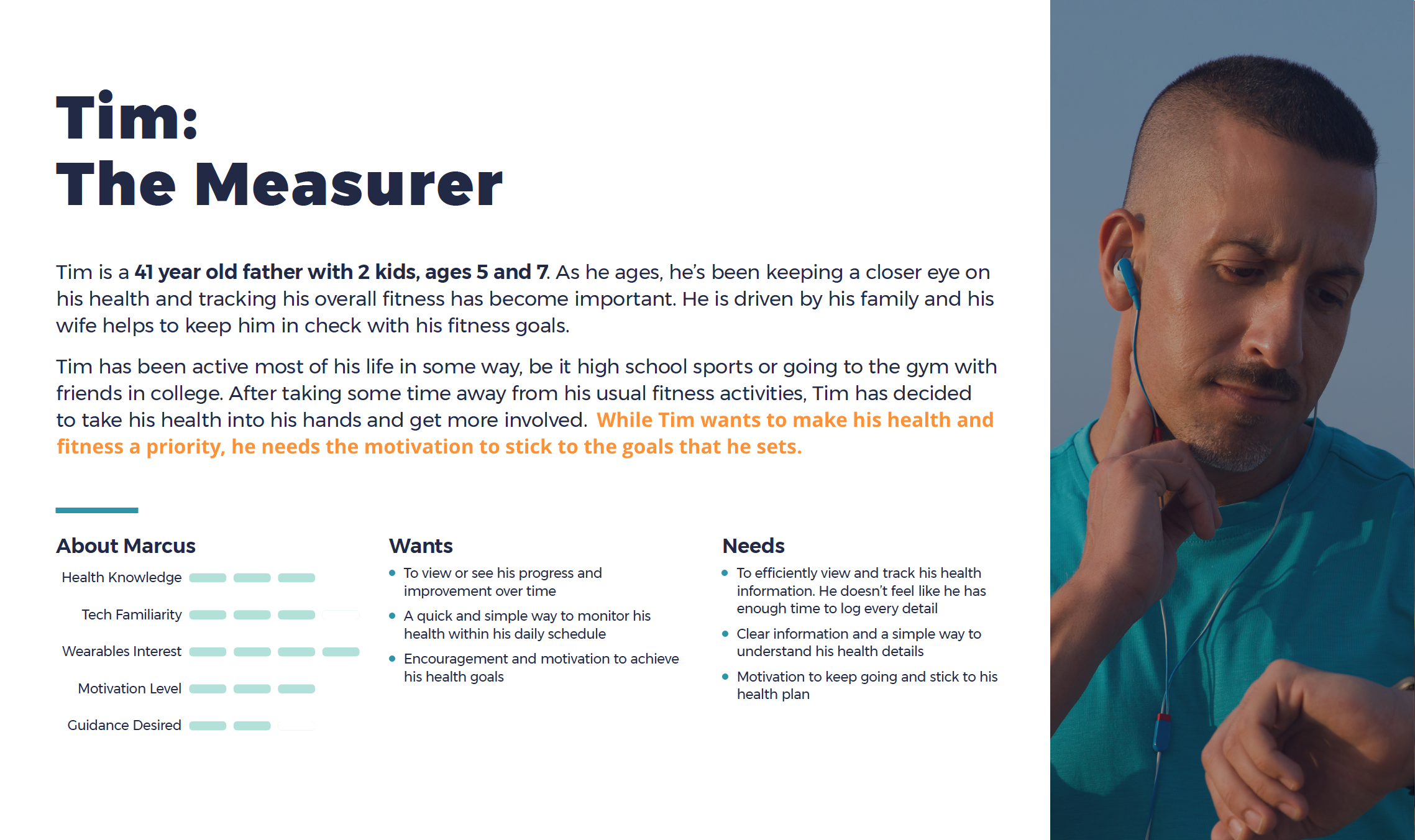
Personas
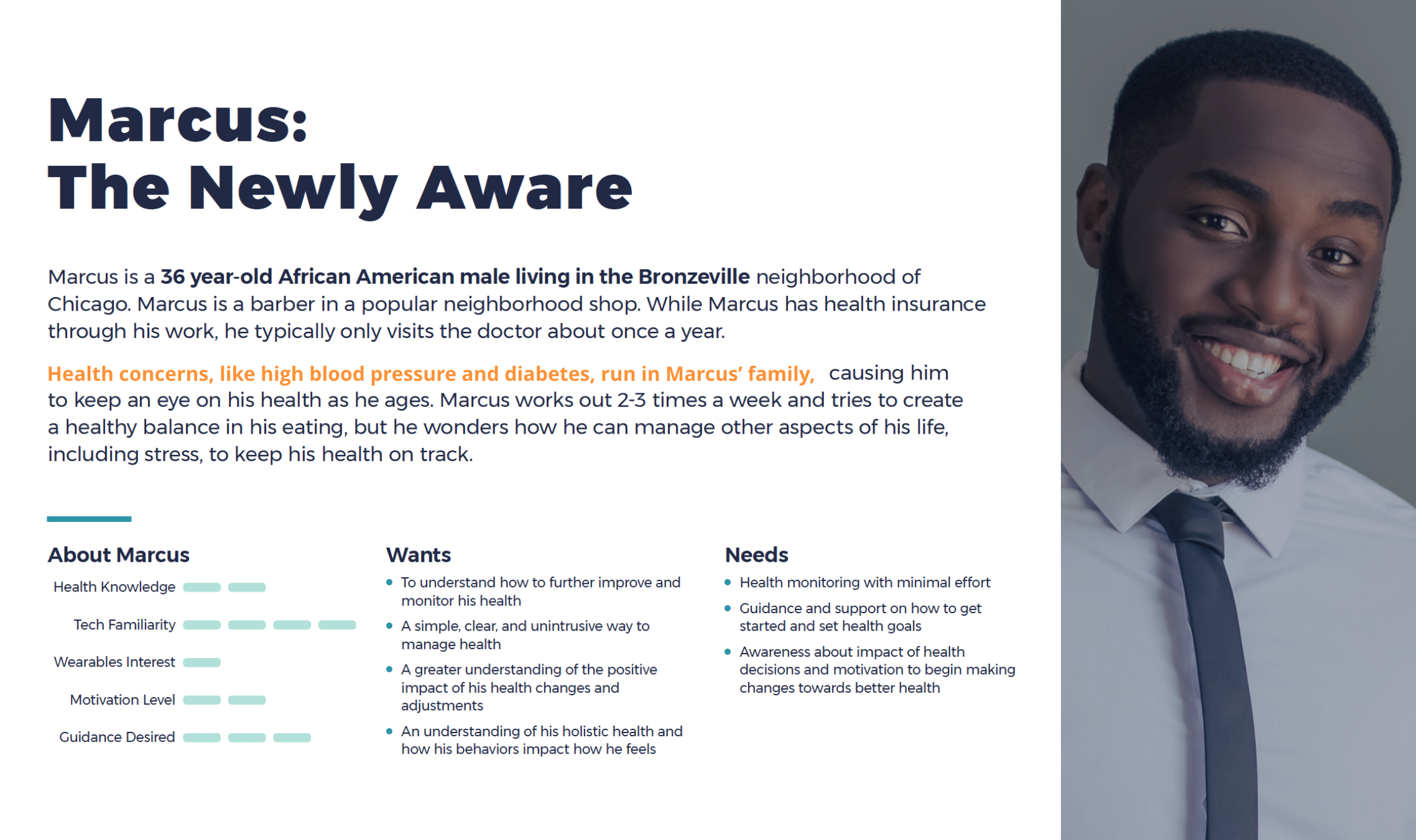
From our research, we created personas that helped to guide us. While we found value in all of our personas, we ultimately focused in on Marcus as the primary persona. This was because he spoke to a recurring trend that we identified in our initial research that we wanted to explore further; Marcus is pre-hypertensive and since we were seeing that lifestyle factors were a major contributing factor to the prevention of hypertension, we were interested in exploring a user’s journey through discovery, engagement, and management.
Intial Designs
Ideation
With a solid grounding in the humans we were designing for, our next step was to start taking our ideas to design solutions. We created How Might We statements which reflected needs expressed by the people we interviewed. These HMWs were organized within our themes of Understanding, Goals, Engagement, and Interpreting Data. The HMWs were then prioritized according to how much value they provided to people and how much effort would be required to develop them further.
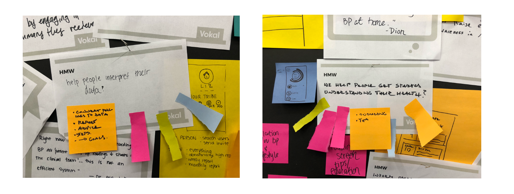
Examples of How Might We statements that informed our sketches
Sketching
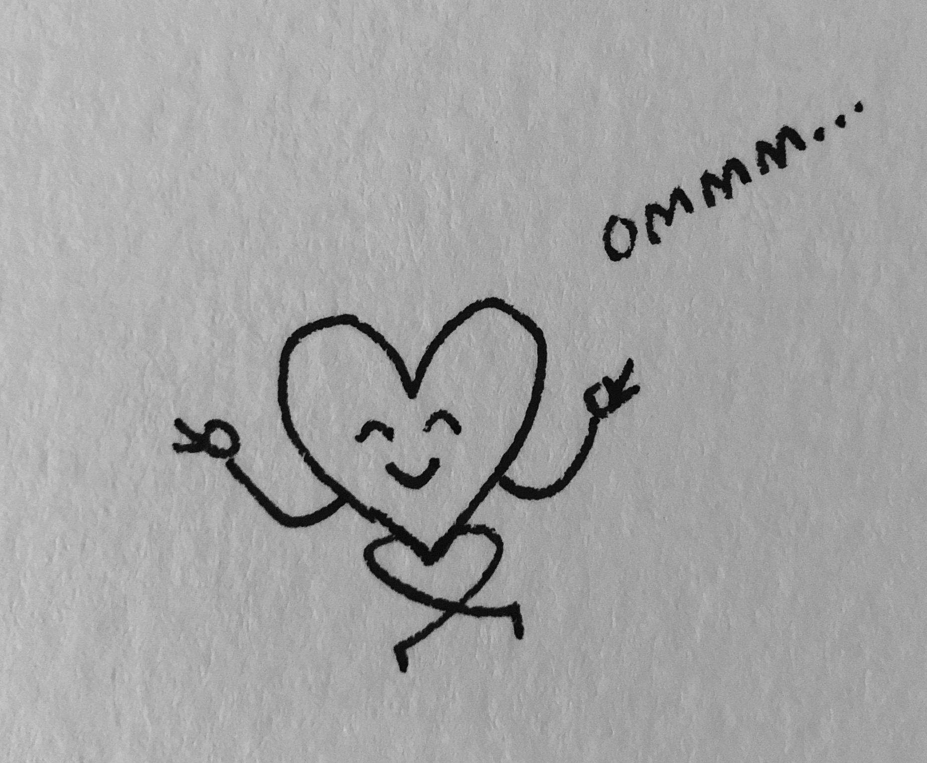
We then started bringing our concepts to life through multiple iterative sketches on paper. Knowing that our key user needs were in the areas of awareness, enagement, and management we focused our sketching solutions on concepts that addressed these user needs. Being mindful of the fact that our users needed assistance, a guiding teacher/coach, in understanding how to manage their blood pressure + heart health, we purposefully kept our concepts playful, informative, and friendly.
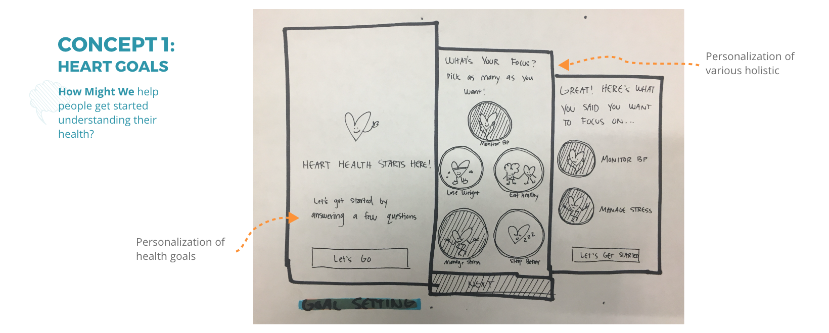
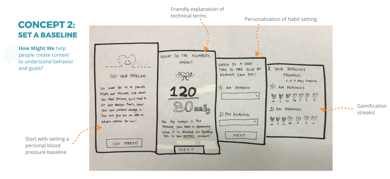
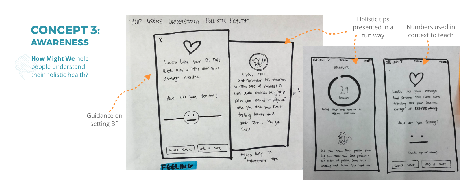
After getting our concepts to a cohesive place, we again put them in front of users to see what was resonating most. Ultimately our users were most interested in the concept of learning more about the context of their blood pressure and how to explicitly monitor it. Knowing that this aspect of transparency was resinating most with our users, we made sure to make it a focal point in our final designs.
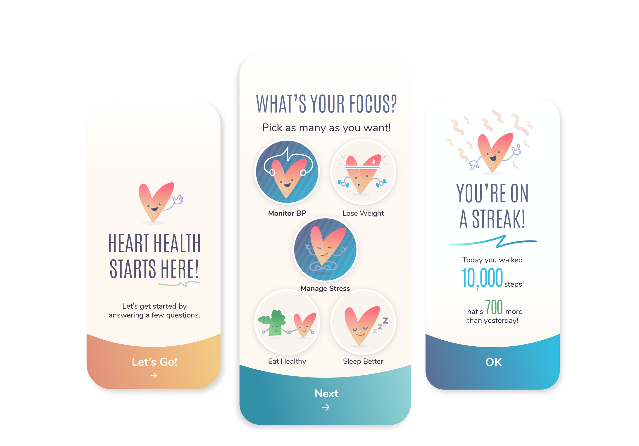
Final Designs
After completing our second round of user concept testing, we worked with our visual designer to mock up high fidelity concepts from our sketches. Our final designs exemplified our key areas of awareness, engagement, and management.
Conclusion
“Because the biological mechanisms that affect our health and well-being are so dynamic, when people change their diet and lifestyle, they usually feel so much better, so quickly; it reframes the reason for changing from fear of dying to joy of living" - Dean Ornish
The final result of this project resulted in a pitch of our ideas to said wearable health device company. However, the best and most interesting parts of this project for me were the human oriented ones - like, how interesting it was to watch users more positively connect with our hand drawn concept sketches versus concepts that we had taken to wireframe form; or the fact that a majority of heart health problems come from eating or access to healthy food - a concept that may be hard to achieve for lower class citizens in fast food laden, "food deserts". Ultimately this project felt good to work on due to it's very tangible ties to helping humans...and it was fun to draw some yoga hearts...